Images are everywhere - and are not just worth a thousand words, thousand tweets, or text or anything not visual.Whether it's a meme, artsy photo, selfie or an article click-bait, a good portion of the websites are increasingly filled with more images and less text. Images are more impact-full than text, more engaging, more insightful and definitely more quick to interpret by human brains.
Oracle Analytics Cloud (5.6.0 onwards) allows users to pick any local custom image and rapidly turn it into a custom visualization. Here is an business example we recently came across : process of manufacturing phosphoric acid. The organization needed to present analytics over a diagram that depicted the entire manufacturing process, for which they had data associated with.

Let's use the Oracle Analytics feature to simply turn this diagram into a powerful analytics visualization. The image on top of which the user wants to perform analytics will be used as a custom map background and the various portions of the image will be used as map layers. The problem statement can be broken down in to 3 simple tasks.
- Upload an image into the OAC platform.
- Identify, mark and designate various portions on the image to represent metrics/attributes
- Use the image to visualize data
Upload an image into the OAC platform
To address #1, the user can now do the following with Oracle Analytics : go to Console -> Maps -> Backgrounds and then click on the Image Background section.

The user can click on Add Image and can choose any image stored locally. All image types are supported and there is no hard limit on the size of image.
Designate various portions on the image : build a custom layer
A new tool now helps users directly draw and mark various portions on top of a image. To navigate to the tool, the user needs to find the image on top of which he wants to draw layers and choose the option to "Create Map Layer".
This takes the user to the digitization tool where he simply has to draw the areas he wants on the image..

Users can draw 3 types of layers on top of the image :
- Points
- Lines
- Polygons
A layer can only be of a single type on, so this pick happens only once. But multiple layers can be build for a single image, and multiple layers can be represented on top of images on Oracle Analytics as well.
Since the phosphoric acid process mainly has rectangles involved, we decide to go with polygon layers on top of this image. Also note that under polygons, the user can draw a rectangles, polygons or circles of any sizes.

We use the Rectangles option to draw rectangles over the various stages in the process of manufacturing acid.

Once the drawing is completed, user can go to the Edit tab and still adjust the position, resize or restructure the objects on the layer. There are options to duplicate or delete objects, and also to undo changes made to a layer.
As and when a user completes drawing an object on an image, a default name gets assigned to it, it appears at the top of the screen and gets added to the list of objects on the left of the screen.

Users should be cognizant of this since these names will be the IDs with which data will be matched against to find the best matching map layer. So it is imperative on the user to go and name the ids of the various layers accordingly.
We have manually renamed the names of the objects on our layer it now looks like the image shown below

Once the user is done creating objects on top of the image, the map layer can be saved.

Behind the scenes a geojson file will be automatically generated based on the layers drawn on top of the image. The user can go under the Custom Map Layers tab in Maps Console and see the map layer that was generated.

Use the image to visualize data
Now the final step is to bring-in the dataset. In our case, it consists of details on the various stages in the acid generation process including power consumption and volume capacity.
We will be making use of the assignment of map layer to a column feature to manually assign the custom map layer generated in the previous step to the NAME column. This step is not required, as map backgrounds and map layers can be configured directly on the Map Visualization properties. However assigning the layer directly in the data preparation step (what we do here) will help Oracle Analytics default the right view/Map layer to this column.

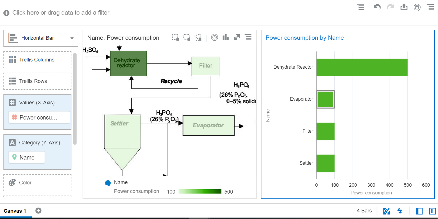
Once in the visualize tab, the user can bring in the NAME column into a canvas and should see map viz render with the acid process image as map background with the custom map layer generated in the previous step on top of it.

We can bring in a power consumption metric to the color edge to show how much power is consumed in various stages.

Also other business charts can be brought into the canvas and the normal DV interactions such as brushing and filtering can be used with image background.

Another example of image background with polygon layer is that of a picture of motor bike shown below

An example of image background with point layers is shown below

This is a very powerful feature and can be treated like a custom visualization for different images.
Thanks for reading our blog !

Once in the visualize tab, the user can bring in the NAME column into a canvas and should see map viz render with the acid process image as map background with the custom map layer generated in the previous step on top of it.

We can bring in a power consumption metric to the color edge to show how much power is consumed in various stages.

Also other business charts can be brought into the canvas and the normal DV interactions such as brushing and filtering can be used with image background.
Another example of image background with polygon layer is that of a picture of motor bike shown below

An example of image background with point layers is shown below

Thanks for reading our blog !
No comments:
Post a Comment