Visualizing data using Maps is usually very compelling to any audience. Remember the 5 W's? Who, What, When, Where and Why. These answers are considered basic when it comes to information gathering or problem solving. Plotting data on a map gives the most rapid & trivial answer to the Where context in a data story.
The Maps unfair advantage
Maps leverage the geographical concepts we all have been exposed to right from the young age.This is of enormous unfair advantage vs other vizs, since there is less brain effort to understand the visualization and more on focusing on insight delivered by the data.
Let us take a simple example of analyzing sales by country. How long does it take to decode first vs second :
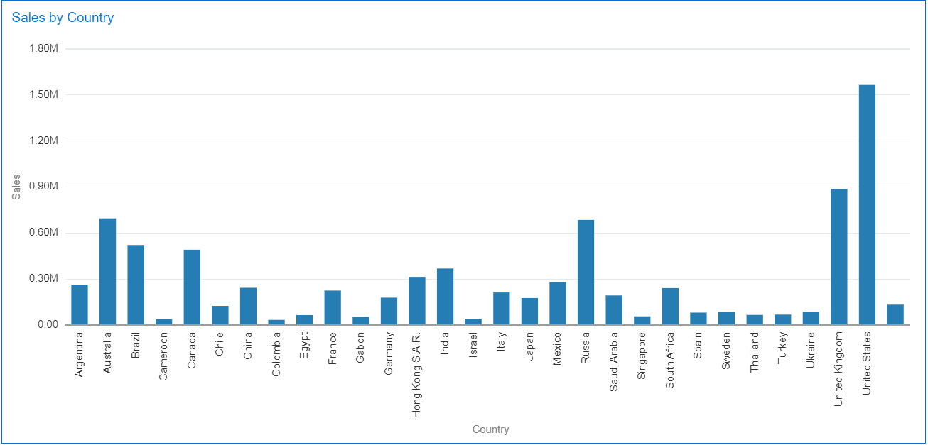 |
| 1) Bar chart depicting sales by country |
 |
| 2) Map depicting Sales by country |
By default most visualization tools will default a dimension + a metric into a bar chart or a variant of a bar chart. But when it comes to geographical objects, these are lot more easier to visualize on a map rather than a bar chart. Oracle Analytics allows to easily assign a default behavior for a given column to visualize it directly a map by default. It also allows to specify which map layer it should default with...
From OAC 5.5 onward the option exists to directly manually assign a map layer to a column in a data set. For this go to Prepare tab -> Choose the column you want to assign a map layer to - > Right click -> Location Matches.

On choosing the Location Details option, it will open up the Location Match dialog which shows the suggested best-matched map layer and also quantitative information as to how well the data is matched with the map layer's data.

User simply has the option to choose any map layer from the existing catalog and assign it to that data column by clicking on the OK button. System will not let him choose a map layer that does not match with any of the data, the option in this case is disabled :

After a successful assignment, the user can notice a Location icon on the column, which indicates that this particular column has a map layer assignment.

There really are 3 significant advantages for assigning your columns to a Map layers :
1) Clear visual indications on columns which have been assigned a map layer
Imagine if the user brings in a dataset with many columns. There might be some columns which can match to a map layer but it is very difficult to find out. The names of the columns might have changed or not very evident to indicate to the user that a map viz might be suited for this column. Even less so to know that a specific may layer exists for this column. Hence the user might be using a different visualization to get some insights which can be tedious and time consuming. With these visual indicators, columns to be visualized on a map can be easily identified.
2) Changing the default behavior to directly default to a map visualization when using such assigned columns.
Previously we discussed how bar chart and other variants were suggested as the best visualization when columns such as city, state, country were being used. Now with the assignment of a map layer to a column,the best suggested visualization will be the map visualization. If multiple columns, each having map layers assigned are used, the map visualization will be suggested and all the columns with map layer assigned will be on the Location edge of the map visualization.
3)Time taken for the map to render is reduced
The process of finding the best fit map layer from the existing catalog of map layers is an expensive and a time consuming operation. Since the user has manually assigned a map layer to the column, this entire process is by-passed and hence the rendering of the map along with map layers is faster.
Obviously, the default visualization behavior can easily be overridden by the user directly while building a dataviz. He can chose to represent the column with other visualization than maps, or other layers. But the default behavior will now take him right away to a friendly place for showing his data.
Are you an Oracle Analytics customer
or user?
We want to hear your story!
Please voice your experience and provide feedback
with a quick product review for Oracle Analytics Cloud!
No comments:
Post a Comment