What should an Oracle Analytics Map visualization show when some of the cities names it supposed to plot on a map do exist with same names in various countries ?
For example, let's take a dataset that includes entries lie Barcelona and Liverpool for cities. We would expect Barcelona to plotted in Spain
and Liverpool to be plotted in England. But it may not always be the case
since there is a city named Barcelona in Venezuela and Liverpool in Canada and
you might end up seeing these points plotted over Venezuela and Canada.
A short, simple fix for correcting this is to add the country name as part of the Map Category grammar. See the picture below, the left viz shows a Map grammar with only City in the Category, the right viz shows it with both Country and City.

On any map visualization, a user can perform a right click and choose the option "Location Matches" to pop up the Location Match Dialog. This helps to inspect how well the data from the dataset has been matched the map layer's data.
 |
| Location Match Dialog for Cities column |
Map Layer drop down:

When the user opens the Location Match Dialog for the first time, the data from the column is matched against the map layer used in the map. This is the layer selected in the drop down of the dialog box, it is a visual indication of the map layer that is matched to. The user can also select a different layer from the list of existing map layers and the dialog will show how well the data from the dataset can match to the newly selected map layer.
Summary Section:

The summary section shows the total number of rows in the user's dataset and also gives the precise number of rows that it had difficulty in matching with the map layer's data. In the above diagram, there were a total of 144 rows of City data matched with world cities map layer and there were issues with 22 among them.
Your Data Column:
The first 'Your Data' column shows the original data directly coming from the user's dataset. It only represents the rows for which an ambiguity or issue was detected.
Match Column:
Match actually shows the data matched to in the map layer (the data that resides geojson file for your map layer, wether it's a Vanilla OAC Layer or a custom Layer that was uploaded by the user).

If the data from the dataset didn't match with any data in the map layer, then a red warning indicator is displayed for that row. If there was a match, but not exactly a perfect match, then a yellow warning indicator is displayed. This does not necessarily mean that it was a wrong match, just that there were other potential matches and the system is not 100% sure which one to pick. So maybe the user would want to review these use cases to see if he can make the match better. For perfect matches, there are no indicators.
Match Quality:
The Match Quality column quantifies how good the match was. When the user opens the Location Match dialog, the rows are sorted from the worst matches to best matches.
- The rows with no matching data with map layers data has the value "No Match" for the Match Quality column.
- Multiple matches are the ambiguous cases. In case the data from the dataset matches with multiple distinct entries of map layer's data, then the Match Quality column indicates how many such matches were found. Common way to resolve these type of issues is to add more information (columns) in the Location edge so that the ambiguities can be resolved. For example, let us revisit our original use case of plotting cities Barcelona, Liverpool on the map visualization. By default when the user bring these cities into the map visualization, they get plotted in Venezuela and Canada respectively instead of Spain and England. Location Match dialog for the same can be found below

Both the entries have ambiguous matches. To give a better picture of the mapping consider the following tables
Your Data
|
Map Layer Data
|
Barcelona
|
Barcelona, Venezuela
|
Barcelona, Spain
|
It found 2 matches for Barcelona entry in the map layer data and gives the Match Quality value as 2 matches. Similarly for Liverpool
Your Data
|
Map Layer Data
|
Liverpool
|
Liverpool, Canada
|
Liverpool, England
|
Now this is telling the user that maybe if he can add more data to the Location Edge, then it can resolve this ambiguity and plot the data point exactly where it is intended to. In this case, if the user adds the Country column to the Location edge, then it can resolve this ambiguity.
After adding the country column to the Location edge, the Location Match Dialog looks like this.

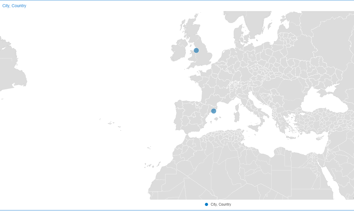 |
| Barcelona and Liverpool plotted in Europe after adding Country column to the Location Edge |
- The next category of matches are the Partial matches. The partial match could be that a part of the word in the user's data got matched with that of map layer's data. In this case, the match quality value is the percentage of how close the two strings are.

- The last category of matches are the Good matches where the data matches exactly with the map layer's data. In this case, the match quality value is 100% Confidence.
Finally we have the Remove column. this one allows the user to exclude rows of data from the viz, and also gives the option to set the scope for which the rows of data needs to be excluded. This includes Project scope, Canvas scope and the Visual scope. Once the user selects the rows and sets the scope, appropriate filters are created to exclude the rows.
Another interesting use case to ponder is what will happen to the Location Match dialog if a user decides to bring Lat/Long columns instead of semantic column types like city, state, country etc.

In this case, the map layer matched to is the Latitude/Longitude layer. There is one less column in the Location Match Dialog because we know what coordinates we are trying to match to. So the Match column just indicates whether the row entry is valid or not.
So the Location Match dialog primarily helps users understand the extent of ambiguous matches or mis matches in their data when they are plotting it against a map layer. It won't automatically fix the data, so the user still has to either bring more data in his viz to remove the ambiguity, or fix the map layer. But the Location Match dialog gives a detailed list of what needs to be fixed to fully match map layers. This is big step in overcoming the barrier of the geospatial data mismatch.
Are you an Oracle Analytics customer
or user?
We want to hear your story!
Please voice your experience and provide feedback
with a quick product review for Oracle Analytics Cloud!
No comments:
Post a Comment