Visualizing multiple layers of business data on a map and
spatially interacting with them, have been a forte of specialized GIS tools,
however it has been a challenge for multiple market leading BI and Data
Visualization vendors.
Recent release of Oracle Analytics is pushing its map data
visualization capabilities to new heights to address such spatial analysis needs.
In this blog we will do a brief tour of the Multi-layered mapping capabilities included in recent release Oracle Analytics Cloud & Data
Visualization.
Multi-layered maps architecture allows users to visualize
data using multiple map layers in a single map visualization. It does that by
overlaying location data on layers represented by different types of geometries
(points, lines, and polygons) or layers with specialized rendering of those
geometries (heatmap or clusters).
One example need for multi-layered maps is if operations
manager of a Railway company wants to analyze traffic by geography which can be
City, Zip code, County, State or by lines. He/she could use multi layered maps
to visualize traffic by City using Point geometry map layer; by Zip code,
county, State using polygon geometry map layer; by line using line geometry map
layer. Here is a quick preview of how such a visualization would look like in
OAC:

This
visualization shows the passenger traffic data (fictitious) of Washington DC
metro by Stations (Point geometry), Line (Line geometry) and by Zip code
(Polygon geometry).
Following video walks through this multi-map layers:
Following video walks through this multi-map layers:
Adding Data Layers on a Map
To render a map visualization you can simply select a
geography column (and optionally its associated metrics) and choose Map
visualization. Map viz in DV looks up the most suitable map layer and displays
that data on map. For example, select zip name and passenger count and display
as Map.
To add more layers of business data to Map visualization, click
on Menu option above Category (Geography) grammar field and select Add Layer.
This will add a new map layer to the Map visualization. A new layer can also be
added from the map properties pane.
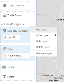

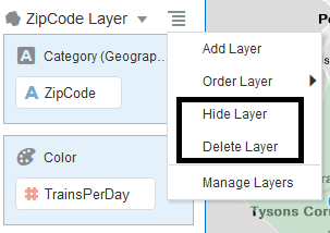
This menu also lets user manage the map layers i.e., to Hide,
Delete or Order a layer. We will discuss ordering map layers later in this
blog. We may add and manage any number of layers using these options.
Once a layer is added, drag and drop the geography column to
be visualized in Category (Geography) field. Map layer corresponding to that
geography field will be auto selected and it gets visualized on the map.
Once all the required map layers are added to the map
visualization, users can view the list of map layers added to the visualization
by clicking on the drop down list next to Menu option. We have 3 map layers for
DC Metro in the example shown above. 1) DC Metro Lines (Line geometries) 2) DC
Metro Stations (Point geometries) 3) DC Zip Code (Polygon geometries).

In latest OAC/DV following layer types are supported in map visualization –
1) Point Geometry layers
2) Line Geometry layers
3) Polygon Geometry layers
4) Heat maps
In this blog we will look at features related to Point, Line and Polygon geometry layers using the DC Metro example above. We will discuss about Heat maps in detail in a separate blog.
2) Line Geometry layers
3) Polygon Geometry layers
4) Heat maps
In this blog we will look at features related to Point, Line and Polygon geometry layers using the DC Metro example above. We will discuss about Heat maps in detail in a separate blog.
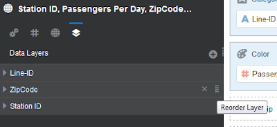
Layer Properties
Data Layers tab under map properties lets users manage the
properties of all map layers like Name of the layer, Map Layer, Layer type, Transparency
of a Layer and whether to show the layer or not. Layers icon highlighted in red
sitting right next to Globe icon is Properties tab of multi layered maps. Map
layers added to this map visualization are listed here. Clicking + icon will
add more Map layers.

Each map layer has a set of properties:
1) Name: By default OAC assigns a name to
the layer with column names used in that layer. Users can change it to any
custom name that they want.

2) Map Layer: Map layer is automatically chosen
based on the match between contents of the column present in Category
(Geography) field and Key columns of the custom map layer. Users can also
change the Map layer and manually assign other layers that are a better match.
Here is quick snapshot that shows how to change a map layer:

3) Layer type: Depending on the type of
geometries defined in a map layer, users can change the type of layer. This
will change the way a layer is rendered on the map. For example: Map layers
with Points and Polygon geometries can either be displayed as points and
polygons respectively or as points. Map layers with Point geometries can be
displayed as either Point or Heatmap.
4) Transparency: Transparency lets users choose the
degree of Transparency of this layer so that other co-existing layers are
visible through this layer.

5) Show Layer: Toggling Show Layer to Off/On will
show/hide the layer from the map visualization. Another way to Toggle layer
display is by clicking on the Map Layer icon in the legend. Here is a snapshot
that shows this behavior:

6) Visualization
Grammar by Layer type: Fields available in the visualization grammar
differs by the map layer type.
a. Category
(Geography): This field represents the geographic columns which will be matched
against the key columns of custom map layer. This field can take multiple
columns and all these columns do not have to match with key columns in the
layer. Values of all these columns will be shown in the tooltip that is
displayed when we hover over that geometry
b. Color: This
field takes either metrics or attribute columns and assigns either gradient or
distinct colors depending on the type of column.
c. Tooltip:
Tooltip field takes metric columns and displays these metric values in the
tooltip that is displayed when those data points are hovered over in the map
visualization
d. Filters: if
you want to apply filters to your dataset
e. Size: This
field can take only metric columns and in case of point geometry, adjusts the
size of the bubble in proportion to the metric value.

7) Legends: Each map layer contains its own
legend and all legends are displayed on the map visualization with appropriate
icons to indicate the map layer to which that particular legend is associated
with.

Users can display these legends on the Top, Bottom,
Left, Right, None or Auto. Selecting Layer icon allows to toggle display of its
corresponding layers
Layer Reordering and Display Controls
Layer Ordering: 'Order Layer' option present in the
Menu option lets user reorder a layer. Here is a quick snapshot which shows the
allowed options with Order Layer:
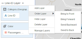

Users can also visually reorder map layers using simple hold
and slide option available in Properties pane. This will reorder the map layers
in the map visualization.

Layer Display Controls: In addition to the Toggle hide layer options described above, hide layer option in Menu lets user Hide a map layer. Functionally this is same as Toggling Hide button in Manage Layer properties Tab and in the Legend. Users can also delete a map layer using Delete Layer option. This will permanently remove a map layer.
Are you an Oracle Analytics customer
or user?
We want to hear your story!
Please voice your experience and provide feedback
with a quick product review for Oracle Analytics Cloud!
7 comments:
nice blog , very helpful and visit us for VISUALIZATION SERVICES in India
Thanks again for the article post.Really thank you! Fantastic.
Visualization is key in representing data. It makes your data stand out, influences your audience, and helps make important business decisions. Data visualization is a visual art form that represents facts and statistics in a way that captures the audience's attention.
Thanks again for the article post.Really thank you! Fantastic.
data science online free
Best Data Science Online Training
It's a very nice article. Thanks for sharing
Stall Designing Services In Mumbai
Sign Board Manufacturers Mumbai
It's a very nice article. Thanks for sharing
Stall Designing Services In Mumbai
Display Rack Manufacturers In Mumbai
Post a Comment