Wednesday, February 27, 2019

Synopsis Mobile Application sourcing from Oracle Analytics Cloud

Have you ever felt the need for a rapid, automatic overview of any of the datasets that are available to you on your Oracle Analytics Cloud (OAC) instance ? From your mobile, right away, over few seconds ?

Oracle Synopsis Application now directly connects to any dataset lying on your OAC instance and immediately creates meaningful analytics out of it. It lets you interact with spreadsheets and business data in a visual and intuitive way—while you're on the go, on your mobile, within seconds.No technical training required, no specific Skills required, the app installs and connects in seconds. 

This 6 minutes video gives a sense of the whole experience. The blog below shares a few more details as well.


Synopsis is available on both Android and iOS devices. At the time we are writing this blog (Feb 2019), the one for Android is a little ahead as it lets you connect to Oracle analytics cloud. The same feature in iOS would be available in few weeks with an upcoming update.

How to connect to Oracle Analytics Cloud using Synopsis

From your Synopsis App, tap the + icon in green to get an option to connect to OAC. Provide the server details and credentials to connect to OAC. Once connected, you will see a list of all the files which are available inside of OAC. Click on a spreadsheet from all the choices you have and let it run some background analysis before rendering the first visuals.


The first visuals

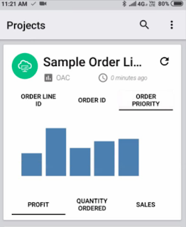
After a bit of background analysis, the first visuals are rendered. The top row on the screen shows 3 attribute columns that you can toggle, the bottom of the screen has 3 metrics suggested from the datasource you analyzed. Clicking on each would display a metric by attribute pair. In the screenshot you see "Profit by Order Priority"


Performance tiles of all metrics

If you wish to see the the metrics available in the datasource, simply click on "OAC". Against each tile, there are options to choose the right aggregation you want.


Choose/Edit the right columns for analysis

Click on the settings icon in the top pane to get to a screen where you can delete, move columns from metrics to attributes and rename columns. Hold on a column until a strike through appears to make sure the column is unselected. Hold and drag columns from Numbers area to Text area. Dragging columns from Text to Numbers makes them as metrics. Turn on the "Edit Column Labels" using which you can edit the column names


Further Analysis

By now I am sure you are wishing to do more with Synopsis. Lets say if you wish to analyze each metric by all the attributes available, click on a performance tile say "Sales". In this screen you will see various analysis of Sales by all the attributes. 


If you wish to edit the visualizations, click on one of them where it takes you to an edit screen. In the edit mode, you would be able to change the chart type, add/remove metrics and attributes, filter the chart based on attributes. 


Statistical Analysis

Once you are in the edit mode of a chart, you can choose to get some statistical information like mean min, max etc, by clicking on the yellow colored "i" icon just above the edit pencil icon


Natural Language Generation - Project Insights

Clicking on the button show in the image here would generate some interesting insights in the data. Things like "If a metric value goes down, then another metric goes up" would be generated by the built in analytics engine.


By editing out a metric or an attribute, the insights automatically run to provide fresh project insights with the new metrics and attributes.

Sharing the report on Social media

Reports and visuals generated on Synopsis can be shared on various media options like Whats app, email, Twitter etc. Click on the share icon on top of each report to share the particular visual.


By now you would have realized that so many functionalities can be accomplished using Synopsis. To conclude Synopsis is an app that provides actionable insights for smart decision making at your finger tips. Soon, you would be able to connect to Oracle cloud sources and leverage the same capabilities on other sources with Synopsis

Are you an Oracle Analytics customer or user?

We want to hear your story!

Please voice your experience and provide feedback with a quick product review for Oracle Analytics Cloud!
 

Thursday, February 14, 2019

Jan 2019: What's new in Oracle Analytics Cloud 105.1.0


Oracle Analytics Cloud - Release 105.1.0 – January 2019 offers several new Administration features and enhancements to improve your overall product Lifecycle experience.

New Features

Admin Related : 
  • Snapshot Enhancements : users have a fine control over the type of content to include in a Snapshot, and the scope of this content has widely increased since last release. While creating a Snapshot, user either chooses 'Everything' which takes a backup of the entire environment or uses the 'Custom' option to selectively pick specific content to back up or migrate. File-based datasets, custom visualizations plug-ins and extensions are available as options to select. Similar options are available while restoring Snapshots : users can choose to restore all the contents from the Snapshot or selectively restore only a few types of objects during restore. These enhancements improve the overall backup, restore, and migration experience from environments to environments.
  • Data file migration utility: This utility complements the Snapshot process for cases when connection between the source and target environments may not have access to the same back-end Cloud infrastructure. Such situations can interrupt migration of some file-based data sets included in the snapshots. This utility provides an alternative way to directly migrate data files from one environment to another in these cases.
  • Configure System Settings and Restart : OAC Service Administration now offers an option within Console screen to edit the configuration of the environment server. Clicking on the 'Configure System Settings' tile in the console screen launches the OAC Environment Manager which allows to override several system settings like
    • ‘Allow HTML content’,
    • ‘Currency preferences’,
    • ‘Prompt autocomplete’ options,
    • ‘Timezone settings’,
    • ‘Default scrolling behavior’,
    • Evaluate support level’, 
    • etc….
Once settings are edited, services can be restarted by a click from the same interface so they are taken into effect. Respective services that need to be restarted (OBI Server, OBI Presentation Server...) are automatically identified and selected in the Restart pop up. The user only needs to click OK to restart those services.
  • Catalog Manager : Catalog Manager utility is now available as part of OAC client install and connects to online OAC services. Using the catalog manager, Administrators can connect to an OAC instance and directly manage Web Catalog. Edit permissions on catalog objects, move objects from folder to another, create a report on catalog objects and save it locally etc…
  • DSS/Data Prep Public Rest APIs : Several Data Set Service REST end points can be called from UNIX curl command, POSTMAN, swagger UI console etc. Using these APIs, developers can perform operations like list all connections on OAC environment, create/update/delete connections, replace/delete datasets, create/update/delete dataflows etc... These APIs open several powerful capabilities to the developer community in leveraging OAC capabilities.
Data Source & Data Visualization Enhancements:
  • Oracle Autonomous Transaction Processing: A data source connector to Oracle Autonomous Transaction Processing is now available. Connection to both Oracle Autonomous Transaction Processing as well Oracle Autonomous Data Warehouse Cloud are made easier now as the Create Connection screen directly accepts the zipped wallet file for credentials. Simply drag and drop the zip file and all the back end details will be automatically identified for the connection : host server name and port number are automatically identified and list of service names are available for selection as a drop down thereby eliminating the previous manual entry process.
  • New Table Viz properties: new properties have been introduced in the Table visualization. 
    • Suppress Repeating Values:  This can be toggled on/off (default off) and controls if values are repeated or not in a Table visualization.
    • Show Duplicate Rows: This can toggled on/off (default off). When set to Off, the metric values displayed in the Table are aggregated using the aggregation rule of the metric. When set to On, Table displays the granular level of the dataset without applying any aggregation on the metric.

Pixel Perfect Reporting (BI Publisher) Enhancements:
  • POV (Point Of View) parameter in an MDX query:  POV as parameter was introduced in the previous release and is improved in 5.1 release. User can now search a dimension in a cube and include a POV parameter value in an MDX query. Similar to SQL query, when including a parameter in MDX query, it will automatically create List of Values and parameter prompt in the data model. Users will get prompted to complete the POV anytime they consume or design a report using this datasource.
  • Snapshot includes pixel perfect reporting: Snapshot files now include BIP related objects: credentials, configurations, and scheduled jobs of pixel-perfect reporting. That allows to easily migrate content from one environment to another using snapshots.
Are you an Oracle Analytics customer or user?

We want to hear your story!

Please voice your experience and provide feedback with a quick product review for Oracle Analytics Cloud!
 

Friday, January 11, 2019

Modify System Settings in Oracle Analytics Cloud


Have you ever felt the need to modify the analytics system settings in an easier way other than getting inside the OS’s file system and editing the files? The latest update of Oracle analytics cloud offers a comprehensive capability to configure system settings easily through a user interface. where  users can alter configuration and restart services through the click of a button.
To access this new capability, from the DV home page, click on the burger icon and navigate to Console. Under Console, navigate to Service Administration. Clicking on Configure System Settings will open a new page where parameters are available for modification. Below is a screen shot of the new screen


To edit the parameters, one must double click on the value and a text box appears where user types the appropriate value. As soon as the value is changed, a call out appears next to the fields indicating that the value has been updated and a restart is required. There is a Restart button on the top right corner which can be leveraged to bounce the services for the parameter to take effect.
Below is a digest of some of the config parameters that can be modified via this interface in the Jan 2019 update of OAC.

Default Scrolling Enabled


This parameter specifies the data view for tabular, pivot, trellis views in BI dashboard. By setting this to true, it sets reports to show the output with Data View as 'Fixed headers with scrolling content'

If the parameter is set to false, it sets reports to show the Data View as 'Content Paging'.

Dashboard Prompt Parameters

Show Null Value when column is Nullable

Have you ever been troubled by the ever-present NULL in your dashboard prompts? Have you ever wondered how to get rid of that NULL value from the prompt? Well, here is the answer. Set the parameter to these values and expect the changes in behavior
always — Always shows the term "NULL" above the column separator in the drop-down list
never — Never shows the term "NULL" in the drop-down list.
asDataValue — Displays as a data value in the drop-down list, not as the term "NULL" above the separator in the drop-down list.

Dashboard Prompt Auto Complete.

Have you ever thought if you can make your dashboard work like google search engine which provides auto complete suggestions? If yes, then it is possible by turning on the parameter “Support Auto Complete” to true.
If you set Support Auto Complete to true, then the “Prompt Auto Complete” option appears under My Account. The same would appear under Dashboard settings as well


In addition to auto complete, here are 2 more additional parameters you can play with for more options.

Case Insensitive Auto Complete: (Default: True)

Specifies whether the auto-complete functionality is case-insensitive. If set to true, case is not considered when a user enters a prompt value such as "Oracle" or "oracle." If set to false, case is considered when a user enters a prompt value, so the user must enter "Oracle" and not "oracle" to find the Oracle record. The system recommends the value with the proper case.

Matching Level: (Default: MatchAll)

Specifies whether the auto-complete functionality uses matching to find the prompt value that the user enters in the prompt field. These settings do not apply when the user accesses the Search dialog to locate and specify a prompt value.
                StartsWith — Searches for a match that begins with the text that the user types
                WordStartsWith — Searches for a match at the beginning of a word or group of words
                MatchAll — Searches for any match within the word or words.

In the below screenshot you can see that I have a Product Name prompt and I have typed “St” and it is being searched for every occurrence in the prompt field


Time zone parameters.


Have you ever wanted to have the date time columns in your report in your preferred time zone? If yes, then there are parameters mentioned below controls the display of time zones.

Default Data Offset Time zone (Default: None):

The time zone offset of the original data. To enable the time zone to be converted so that users see the appropriate zone, you must set the value of this element or variable. If you do not set this option, then no time zone conversion occurs because the value is "unknown". An offset that indicates the number of hours away from GMT time.
For example: "GMT-05:00" or "-300", which means minus 5 hours.

Default User Preferred Time zone:

Specifies the users' default preferred time zone before they select their own in the My Account dialog. Setting the value here will affect the default time zone under my account in BI answers and dashboards.
For example: (GMT -02:00) Cairo


Setting Currency preferences


With the new user interface, currency settings can be managed in Oracle analytics cloud by uploading the currencies.xml and userPrefcurrencies.xml, which earlier had to be saved in the file system. Double click under the property value of the respective parameter to enter edit mode.
Upload the appropriate xml files to currencies.xml and user currency preferences.xml to obtain the desired currency functionality.
In OAC, currency settings are similar to the way it is done in on-premise OBIEE. Please refer to the documentation link for more details.


Are you an Oracle Analytics customer or user?

We want to hear your story!

Please voice your experience and provide feedback with a quick product review for Oracle Analytics Cloud!


Friday, December 7, 2018

Adding 3D Charts to Oracle Analytics

There was a time, not too long ago, when pretty much all business graphics consisted of poorly labelled, hideously colored line charts and bar graphs.There was a dearth of different types of visualization which can help to read and analyze the data in a better way. Then people discovered the ability to create "3D" charts and now the once unattractive but essentially harmless business charts turned into a visually pleasing graphic which wows your audience in a good way. Though there are critics on the usage of the 3D charts, it is still one of the most popular visualizations in modern reporting.


Oracle Analytics helps you consume 3D charts, for example a 3D bar chart in the form of a custom visualization plugin with the ability to zoom in/ out and to rotate. Unlike a static 3D chart, this plugin helps you understand the context of 3 dimensions at much greater detail with ease.

It requires 3 inputs:
- 2 of which are attributes that define the position in the 3D charts
- 1 of which is a measure that determines the height of the corresponding bar charts


3D charts seems to make data more exciting thus making people pay more attention to it and there is popular maxim that goes like this - "by adding 'depth' to a graphic adds depth to the data analysis". However 3D charts can be misleading and can work against you if not looked at correctly.

Are you an Oracle Analytics customer or user?

We want to hear your story!

Please voice your experience and provide feedback with a quick product review for Oracle Analytics Cloud!
 

Monday, November 19, 2018

Comparative Tiled Growth Rate : immediate deep insight on your data using Oracle DV Templates

Oracle Analytics Cloud offers the ability to apply an existing analysis on any other dataset, different from the one it was built on. This feature is called Replace Data Set. By leveraging this capability, one can re-use any existing project to gain insight on virtually any dataset. Pre-defined Projects can be used as templates for anyone to gain deep insights on their own datasets.

In this post, let's see how to leverage the DV Growth Binning example available on Oracle Analytics Library (https://www.oracle.com/analytics-library).

What is the DV Growth Binning example project ?

The Growth Binning example originally uses a dataset about Countries Ecological Footprints. The data shows 50 years of history on an aggregated carbon footprint metric for 176 countries over the world. The DV calculations help grouping these countries into 5 equal groups (quintiles), according to the growth rate of each countries on that metric over 50 years. First group shows slowest growing countries (countrieds that showed decrease in their carbon footprints over years this case), last group showing the top fast growing countries.


The DV project then shows a few more details of which individuals make-up each group, in two different canvases : Details and List. List, in particular, is a page showing all the individuals sorted by their growth rates but also indicating the gross value of the metric. That allows to immediately recognize individuals that have significant contribution in value, and high or low growth rate.


The project delivers this insight for year-based, quarter-based or month-based analysis, to accomodate for datasets that have different time-spans or grain. All of the calculations are run-time project calculations, no Data Flow is needed.

How to apply this insight to my own dataset ?

This project can be used as template on any other dataset, as long as a date and a metric exist in the dataset. This is done by simply using the Replace Dataset feature, the process is very simple and takes just a few seconds. This brief video shows a recording of applying the project to various datasets :

By leveraging the Dataset Replace feature, every project can become a template that anyone can re-use on various datasets, within seconds, like in this example. This empowers Oracle DV users to get to deep insights extermely quickly on any datsets.

Are you an Oracle Analytics customer or user?

We want to hear your story!

Please voice your experience and provide feedback with a quick product review for Oracle Analytics Cloud!
 

Tuesday, November 6, 2018

Un-documented Beta OAC 18.3.3 Feature : Configuring Synonyms for ASK Interface

The ASK interface in with OAC is a very simple and direct way to gain insight about your data in seconds. Just type (or pronounce) phrasal questions, OAC will interpret your question, match it with most likely measures and attributes exist in any indexed dataset you have access to, and return visualizations that best meet your question. Simple and efficient, this works both in the web based OAC UI and via the mobile interface in Day by Day Application.

OAC 18.3.3 (Sept 2018) introduced several enhancements to ASK, like better interpretation of questions constructs, understanding of Top/Bottom question syntaxes, etc. But one feature only made it as Beta in 18.3.3 because a robust finalized UI was still lacking : configuring Synonyms for column name indexes. This feature did not make it into documentation, but is already operational in 18.3.3 pods.

The configuration of synonyms using the beta feature is simple and quick, but quite manual and fragile. File syntax and dataset names are to be strictly respected. This short video briefly describes it.


The feature will be greatly enhanced in upcoming releases of OAC both for the experience, the UI and the capability. The current status of it may not migrate automatically when the feature is fully released. 
But in the meantime it can help address some immediate needs today. Like for example rudimentary translation of system defined column names in different languages so users get to ask simple questions in their native tongue, and get answers from a single source in ASK.

Are you an Oracle Analytics customer or user?

We want to hear your story!

Please voice your experience and provide feedback with a quick product review for Oracle Analytics Cloud!


Wednesday, October 10, 2018

Dataflows gets better and smarter

Data flows in latest version of Oracle Analytics Cloud is more powerful and useful than ever. Lets take a look.

Data flows in Oracle Analytics lets users take one ore more data sources, join them and transform the data to produce a curated set of data that users can use to visualize and analyze. Data flows have various inbuilt functions/nodes like Adding new columns/calculations, Removing columns, Grouping, Binning, Training different Machine Learning Models, Forecasting, Sentiment Analysis etc to transform and enrich the data.

In the latest version of Oracle Analytics more new features like Dataset Prompts, Branching, Incremental data processing, Output columns metadata management etc are added to dataflows. We will go through each of those new features in detail in this blog.

Dataset Prompts: 

Dataset Prompts feature lets users choose input or output datasets to a dataflow on the fly at the time of executing/running the dataflow. Prompt option is useful in cases where a user would like to reuse a complex dataflow with another dataset or to return output dataset with a different name without having to edit the flow by opening it. Prompt option can parametrize the input and output datasets of a dataflow. By default this option is disabled and users have to enable it by clicking on Prompt check box. Here are a few snapshots that show how to enable Prompts for dataflows:


Name field takes the default dataset name as input. This should be the name of actual dataset present in the instance.
Prompt field takes the prompt text to be shown when running the dataflow.
Prompt option is available for both input and output datasets of the dataflow. If Prompt option is not selected dataflow will run with the dataset selected during dataflow creation/edit phase.

This is how the prompt window looks like when a dataflow with prompts enabled is run:


To summarize Prompt option adds a great deal of flexibility to running the dataflows by specifying the input and output datasets on the fly without having to edit the dataflow.

Here is a video which demonstrates Dataset prompt feature in dataflows:


Branching:
Branching option allows users to branch the output of a node(except Train ML Model node) in the dataflow into 2 or more branches. Users can apply different transformations on different branches and save the outputs of these different branches to different datasets. End node of each branch will always be Save Data. To add a branch node click on + and select branch node. This is how the branch node and its options look like:

                   
Number of branches can be incremented or decremented by entering the value or using UI options. Each branch can process disjoint subsets of data and return distinct outputs. For example in the below snapshot 3 branches are added to Sample Order Lines dataset.


1st branch computes Sales by Customer Segment and saves it in a dataset.
2nd branch computes Sales by Product Category and saves it in a different dataset and
3rd branch adds month column and saves the entire result in a different dataset.

On running/executing this dataflow three different datasets will be created. Here is a snapshot of the output of these 3 branches:


To summarize Branch option is useful when user wants to do different transformations on different subsets of data and save it separately.

Here is a quick video tutorial that shows how branch option can be used:


Output Controls:
Output controls feature lets users decide how an output column of a dataflow should be treated and saved as (Attribute or Metric) in the output dataset. For metric columns default aggregation can also be chosen. On adding Save Data node to the dataflow users are provided with option to decide how each of the output columns should be treated as. Users can select Attribute or Measure from the drop down list. For metric columns users can select the default aggregation rule. Here is a quick snapshot that shows how users can change the data types and default aggregation rule for columns:


To summarize this feature provides more control to users over datatype of output column.
Here is a quick video tutorial that demonstrates this feature:


Incremental Data Processing:
Incremental data processing feature allows users to run the dataflow for incremental data/rows that become available between batch runs. This feature helps in efficient usage of resources to run dataflows only on incremental data rather than re-running on data which is processed already. This option is available only for datasets created from Database connections and this can be enabled only for a single input dataset within a dataflow.

Enabling incremental processing for a dataset is a two step process:
1) First step is to set New Data Indicator column while creating the dataset from a database. To enable incremental processing set New Data Indicator field to one of the columns from the dataset in configuration page. New data added to the database will be identified based on this indicator column. Here is a quick snapshot which shows how to configure the new data indicator column:


In this case New Data Indicator column is set to TIME_BILL_DT (date) column.

2) After adding the newly created dataset as an input to the dataflow, select "Add New Data Only" field to enable incremental processing for this dataset. Here is a quick snapshot that shows how this should done:


Now this dataset is enabled for incremental processing and any updates to this dataset/table will be processed incrementally in the dataflow when the dataflow is run after making changes to the dataset.

Output of the dataflow for the incremental data can either be appended to the existing output or can replace the existing output. Here is a quick snapshot which shows where to choose this option while saving the output dataset:

                                     
Now all the required parameters are set for incremental processing. When we save and run this dataflow for the first it will be run for the entire dataset and for subsequent runs, dataflow would be run only for the changed(added or removed) data in the configured dataset.

Here is a quick video tutorial that demostrates incremental data processing capabilities of dataflows:


Are you an Oracle Analytics customer or user?

We want to hear your story!

Please voice your experience and provide feedback with a quick product review for Oracle Analytics Cloud!