Saturday, February 27, 2021

Multiple Top N Filters – Part 1 of 2

Top N analysis is a useful technique and helps in focusing on a small ordered set of data items from a large dataset.  They help in answering queries like 'What are the Top 5 products that have had maximum Sales' or ' Who are the top 3 agents who sold maximum policies' and so on. Oracle Analytics offers Top Bottom N filters that allows you to easily perform Top N or Bottom N analysis.

Please take a look at this brief video about Top Bottom N feature in Oracle Analytics.

In Oracle Analytics, Top N filters can be applied on metrics and attributes and help in restricting the number of rows retrieved in the dataset. While it is easy to understand the results when we apply a single Top N filter, what exactly happens when we apply more than one Top N filter? When we apply two Top N filters, does filter 1 get applied first and filter 2 gets applied on the results of filter 1 or vice versa? Does the sequence of filtering depend on the position of filters in the canvas? These are some common questions we encounter when we think of multiple filters. In this blog, let’s understand what exactly happens when you apply multiple Top/Bottom N filters.

Let’s use a Student Analytics dataset containing academic details of students like degree, major, institution, course, grades, faculties etc.

Let’s say we want to apply two different Top N filters on this dataset

  • Filter 1: Top 10 Major by Student Count
  • Filter 2: Top 5 Degree by Student Count

Let’s consider these two filters as two circles in the following Venn diagram.

Circle A represents the result of Filter 1 and the circle B represents result of Filter 2. When Filter 1 alone is applied, circle A is shaded representing the output of the filter.

Similarly, when Filter 2 alone is applied, circle B represents the output.

When both the filters are applied, the output is represented as the intersection of A and B.

Let's use this explanation and understand how multiple filters work in Oracle Analytics. First we create a project using this dataset and add three tables as follows:

  1. Table 1: Student Count by Major
  2. Table 2: Student Count by Degree
  3. Table 3: Student Count by Major and Degree
    

Unfiltered Output


In the above picture, Table 1 shows Student Count by Major, Table 2 shows Student Count by Degree and Table 3 at the bottom shows Student Count by Major and Degree with Major as rows and Degree as columns. On the status bar at the bottom, we see that there are 119 rows and 27 columns in Table 3 before applying any filters. This indicates that there are 119 Majors and 27 Degrees in our compelte dataset.

Apply Filter 1 

Now, let’s first add Filter 1 to the canvas on the attribute column Major. Drag/drop Major to the filters section, make it a Top Bottom N filter type and specify Top 10 by Student Count. Following is how the filter definition looks.

Once this filter is applied to the canvas on all the three visualizations, we see the following results

Filter 1 Applied


Table 1 is filtered and only shows Top 10 Majors by Student Count. In Table 2, the Student Count value has reduced as a result of the filter. Table 3 at the bottom is also filtered and shows 10 rows and 14 columns. 

Apply Filter 2

Let’s disable Filter 1 and add a new Filter 2 as follows.

Now in Table 1, Student Count has reduced, Table 2 has Top 5 Degrees by Student Count and Table 3 at the bottom shows 65 rows and 5 columns.

Filter 2 Applied


Apply Filter 1 and Filter 2

Next, let’s enable both the Top N filters. When both the filters are applied, Table 1 shows only 7 rows, which is the result of Filter 1 and Filter 2 applied together. Table 2 shows only 4 rows instead of 5 as both the filters are applied and Table 3 shows 7 rows and 4 columns. This output represents the intersection in the Venn diagram that we saw above. In this case, filters are applied on all the three tables. 

Filter 1 and Filter 2 Applied


This implies that when multiple Top N filters are applied, they do not get applied on the dataset sequentially. Instead, the two filters get applied independently on the dataset and the intersection of the resulting two filtered datasets is what we see as the final output. The same logic can be applied for more than two Top Bottom N filters. Also note that changing the order of the Top Bottom N filters will not have any impact on the results. We will end up with the same result.

Thank you for reading this blog !

Thursday, February 25, 2021

Creating a vanity for Oracle Analytics Cloud

Oracle Analytics vanity URLs allow you to customize your access point to Oracle Analytics giving your own deployment a custom, easy to access end point. 

This blog will accelerate your vanity URL deployment, total time to set it up should be less than 10 minutes. Should you seek additional details and use cases beyond this blog overview, you can also refer to the official documentation on creating vanity URLs here.

Here is a Vanity URL example pointing to Oracle Analytics :


The following steps will walk you through setting up a vanity URL

But before you get started please review the top FAQs on creating vanity URLs, many time saving tips are contained here and will assist in setting up your vanity URL for test or exploration purposes quickly. 
Also, be aware that there are prerequisites to configure a vanity URL for an Oracle Analytics Cloud instance : 

  • Obtain the custom domain name you want to use from a web service provider or use the domain name of your company.
  • Add a DNS entry that maps your custom domain name to the IP address of your Oracle Analytics Cloud instance.
  • Obtain a public digital X.509 certificate (.pem) for your vanity domain name from a Certificate Authority.
  • Obtain a private key file (.pem) that matches the certificate’s public key.


Step 1. Create your OAC service

This assumes you don't already have an OAC service up. Logon to your OCI console and from the left menu navigate to Analytics > Analytics Cloud


Create your OAC service to your requirements and once active confirm  you can access using the default vanilla URL provided for the service


Next, you need to obtain our analytics deployment IP address. Use your OAC CLI tools and logon to the tenancy where your Analytics instance is deployed and run the command : NSLOOKUP your OAC instance- see example below. Make note of the IP address in your deployment as shown in red


Step 2. Confirm your trusted certificate and key file

As exposed in the pre-requisites part, your trusted 509 cert and key file should be generated and provided by your company or domain admin. If you are simply looking at test-drive on the vanity URL functionality, you can use the following ‘dev hack’ workaround to test on your own. If you are deploying it for real and already have a trusted cert and key file proceed directly to step 3.

To create our own cert and keys for test purposes copy the following to files to a directory where you will make the cert: domains.ext and GenerateCASignedCert.sh to any linux based OS or Windows OS with a linux type cmd line executor (for example GitBash)

  • Open the domains.ext and modify the DNS.1 entry to reflect the vanity URL name you desire for your OAC deployment. In our example our vanity URL will be yellowlab29


  • Next run the ./GenerateCASignedCert.sh script (note the name you append to the end of the script execution will be the name of your files created.

  • When the script is completed 8 different files will be generated, we however need only the crt and .key files with your desired URL name required to create our vanity URL.  In our demo we require samplecerts.key and samplecerts.crt

Step 3. Configure your vanity URL

Return to your OAC deployment and click on create vanity URL


Enter in the domain name specified earlier in your certification creation.  In our example we are using yellowlab29. Upload your certificate and private key and click create.

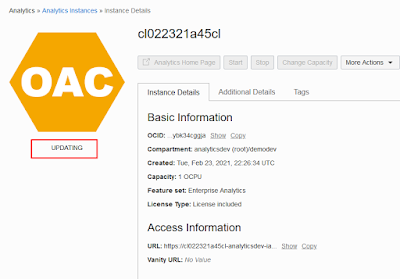
You will then be prompted that your vanity url was created successfully. OAC will remain in a state of updating until the vanity URL is available


While we wait for OAC to become active again open your local machine host file and add an entry specific to your deployment. You will need your IP address obtained earlier in the blog as well as your specified domain name. Save file and exit.


After about 4 minutes OAC will become available again with your vanity URL active


Finally we must upload the root.crt that was created in step 2 into your browser

We can now access our OAC instance using both our standard URL and newly created vanity URL

Thank you for reading this blog !

How to Calculate Top N Versus Rest of Population in Oracle Analytics

Oracle Analytics enables users to easily filter visualizations or whole canvases by using Top N or Bottom N filters. These filters have several nice options such as starting from a Metric, or starting from an Attribute, or even setting the 'implicit grain' that will control what level of aggregation the Top N calculation will start from. These filters come extremely handy in most situations.

But Oracle Analytics also supports many other powerful calculation in this context. One of them, for example, allows to simply address : what is the total (or average) value of all the other individuals that are not in Top N... For example, how do sales of each of our top 10 offices in the world, compare with average offices sales of all the non top 10 ? 

This blog entry explains how to design this calculation in Oracle Analytics, and highlights techniques used for this, that will also be useful for other calculations. In particular, the ability to force an aggregation at a given 'implicit' level, or also the ability to set a second aggregation, at the visualization, after the Oracle Analytics engine first aggregation to provide initial query results. 

We will take the example here of Sales data in various cities across the world (133 cities). Our objective is to show a bar chart with 11 bars, with 10 bars showing respective sales total for top 10 cities in sales, and 11th bar showing the average of all remaining non top 10 cities (aka 123 remaining cities). For now, the data we have on our starting chart looks like this, I have simply high-lighted the top cities on the chart with my mouse


We can apply a filter on our viz or canvas, or if we build a calculation using TopN function like the one below : TOPN(Sales,10)

but as we do this, the chart will show only be filtered top 10 cities only :


What we need is the same as the chart below, but with an extra 11th bar showing the average sales value by city, for all the non top 10 cities. To achieve this, we will use a combination of Rank(), Attribute() and case when function in OAC.

First, let's calculate the plain rank of each city, based on it Sales value. We use Rank(Sales) for this: Rank(Sales). This simple ranking will compute the rank of every row we have in the results of a report, and will return a number (a metric). So, we can try to use this formula now : 

case   when Rank(Sales)<11 then City    else 'All Other Cities'    end

This calculation works, when we add it to our chart, we can see proper coloring of top 10 cities vs all the rest of the cities


But now, we need to aggregate all the blue cities into a single bar, the 11th bar. 

  • If we simply drag the new calculated attribute into Category field, and remove the city column from the viz, it will not render the chart we expect. In this case, the expression will evaluate Rank(Sales) as rank of total sales - that is, 1 total value, not by city, so it will return a rank value of 1. The condition will be fulfilled : 1<10 so the expression will return all the cities. Not what we want.
  • if we drag the calculated attribute in other viz grammar fields, the chart will error out (logical explanation for this, but too long to expose here)
What we need to do, is to force the Rank calculation to happen at the city level : aggregate sales by city, then rank() each, then apply the case when formula. This must happen, even if city column is not part of the viz grammar. The Attribute function in Oracle Analytics allows to force this leveling in the calculation :

case  when 

Attribute(  Rank(Sales)   by City)   <11 then City    

else 'All Other Cities'    

end


When using this formula in the chart, it works, we are getting closer to what we want. Now we only see 11 bars, with the 11th blue one aggregating all the cities that are not in the Top 10 sales :

But one problem remains, since there are 123 cities in the non top 10, the sum of all the sales for these is bigger than the individual top-ers. What we need is to show the average value by city, for the 'All Other Cities' bar. That is simple to achieve using the Viz properties in Oracle Analytics, and does not require any calculation.

Click on the bar chart itself to select that viz, then go to the bottom left of the screen in the Viz Properties fort that Viz, and there, click on the Metrics Tab (# sign). This tab offers various options to tune for the metrics used in the viz. In our case, Sales is the only metric used here. At the bottom of the option list for Sales Metric, there is an option for Aggregation Method. That is a very important option, as it defines the aggregation that will happen at the viz level, after the Oracle Analytics engine has already returned computed results from the query. So that's a second level of 'browser aggregation' that we can make happen here for that viz. Let's click it and select Average instead of Auto.

But that's only half of it, as we click that agg rule, the chart does not yet change. Oracle Analytics is applying this aggregation only to the results set returned by the engine. There are 11 rows returned in the results set here, all we have done is to switch, for each row, from sum of a single value in the row to average of a single value in the row. That's making no difference for now. What we want, is to force the viz average aggregation to happen at the city level, not just the result set level (11 rows). Even if city is not part of the query here. 

Easy to do : there is a By property just below the aggregation one we used, we simply need to click it, and navigate the wizard to select the city column in our dataset. That will force the Viz Average aggregation to happen 'By City' which is what we want.


As we click this, now the chart changes and really shows the insight we needed, with average value of sales by city, for the 123 cities in the 11th bar. We can see how this compares visually


This technique would apply the same as well if we had picked a different object than City for the aggregation by. If we had picked customer for example, the chart would have shown us : for the top 10 cities and for the rest of all grouped the non top 10, what is the respective average revenue by customer
As you can see in the picture below, the cities shown are the same (still the top 10 revenue cities, plus the 'All Others'), but the values show and hence the sorting are very different. It's a different, powerful analysis shown :


This technique applies to all vizs where metrics are used. The two important take overs in this process were 
  • the fact that we built a calculation which was forced at a level of detail by using the Attribute() function in Oracle Analytics. 
  • we then also cumulated a second sequential aggregation rule, at the viz level, that allowed us to also be set to happen implicitly at the level of our choice (city, customer, etc).
These two are very powerful capabilities for easily designing all sorts of level-based analysis in Oracle Analytics. This video walks through a live example of the process (& more) what we just followed in this blog, if you are interested.


Thanks for reading this blog

Wednesday, February 24, 2021

OAC Integrating WMS Maps

What is a web map service? 

Web Map Service (WMS) is a standard protocol for serving geo-referenced map images and data generated by a Geographic Information System (GIS). The Open Geospatial Consortium developed the specification and first published it in 1999. So, simply put, WMS is a way of interacting with a web server which hosts map backgrounds. 

Oracle Analytics now includes the capability to directly consume map backgrounds via WMS. In this blog we will see how to set up a communication with a WMS server to create new map backgrounds for the map visualization in OAC.

Let us take the following example of web map server.

WMS Map representing the Ecosystem Vitality Objective - Fisheries

The above image shows a map background representing the world countries and a layer on top of that which depicts the Ecosystem Vitality Index for Fisheries.

This web map server also additionally hosts multiple other layers which are shown on the left side pane like Ecosystem Vitality index for Climate, forests, water, etc.

WMS map representing Ecosystem Vitality Objective - Climate layer

WMS Map representing the Ten-Year Percentage Change Layer


Now let us see how to bring any of these maps as a map background option in Oracle Analytics Cloud.
In OAC, go to Console -> Maps -> Background -> Add Map Background. You should see two options show up called Web Map Service and Tiled Web Maps.


Clicking on Web Map Service opens a dialog with numerous fields to be filled for setting up a WMS configuration.


  • The first two properties are Name and Description. Name is the name that the user wants to assign for the WMS map background. For this example, let us assign the name WMS example. Description is optional, we will leave this field empty for now.
  • The third property is URL : the URL of the web map server. The details of this should be provided by the admin of the map server.
  • Small check box below the URL field : this needs to be checked so that the domain name of the map server is automatically added to the list of safe domains and the requests from OAC to map server are no longer blocked.
  • The next property is the version number. By default is it pre-populated with WMS version 1.1.1. Check with the admin of the map server to get the correct WMS version numbers. In general most of the WMS servers support both 1.1.1 and 1.3.0 WMS versions.
  • The CRS property is set to EPSG:3857 by default and this is because we are rendering the map background in a 2D format.
  • The Layers property is the place where the user is required to enter one or more layers to render on the map background. In the current example, it does not make a lot of sense to add multiple layers since they will superimpose on each other. So let us give one layer name which depicts the  Ecosystem Vitality Index for Fisheries. In a case where a web map server hosts multiple layers and if one such layer is information on important places and other layer includes information on important routes in the area, then it would make sense to add multiple layers to our WMS config. The layer information needs to be provided to the user by the admin of the map server.
  • The final property is Format property and is defaulted to PNG option. All web map servers support PNG option.


Having entered all the fields we can now click on the SAVE button. A message should pop up saying that a page refresh is required for the map config to become active. Once the page is refreshed (F5), we should see the WMS map appearing as an option in the backgrounds tab. Inspect the WMS map and click on the preview tab. We should see the Ecosystem Fisheries map rendering inside Oracle Analytics.


In an OAC project, upon creating a map visualization, user can go to the Background Map property in viz properties dialog and choose the newly added WMS map background to render map layers on top of this background.


How to know the value of parameters for my WMS service ?

Web Map Servers typically support the getCapabilities request. Using this request in the configuration url, a user can invoke it to get all the information he needs to fill out a WMS map configuration. This makes the user completely independent on the admin of the map server to provide all the information.

The http request has the following pattern :
<url_of_wms_server>?request=getcapabilities&service=wms

This should return an XML file which has all the information needed to fill out a WMS map config. Search for "layer" in the XML file to find all the layers supported by the web map server. Take the value under the <name> tag to fill it in the Layers property field in OAC.

Finally, there are some web map servers which restrict the domains that can connect with them. If OAC does not happen to be on the list of domains which can connect to the web map server, the server does not respond to the requests and hence we might not see anything rendering as a map background.
These are the cases where the map servers are highly restrictive and there is not much that can be done from OAC side

Thank you for reading that blog !

OAC integration with XYZ Tiled Web Maps

Tiled web maps or XYZ tile layers are maps that are displayed in a web browser by joining dozens of individually requested image or vector tiles from a web server. Along with WMS, XYZ tiled web maps are one of the most popular techniques used to display maps and to enable user interactions such as panning and zooming. 


The above picture shows a tiled web map of OpenSteetMap style focusing on Melbourne, Australia. At this particular zoom level, the map is sliced into various number of smaller tiles and the requests are sent to the webserver to fetch and render the appropriate tiles.  

Though both WMS and XYZ tiled web maps ultimately helps in a displaying a map in a browser, there are some fundamental differences between these two.

Performance:
Tiled web maps are generally much faster and more performant than WMS. This is because the entire map is split into various number of small tiles and the time taken to request and display the tiles is computationally less demanding than fetching then entire map to be shown in the viewport in a few image requests. The latter is how WMS is designed to work. Also the user experience while panning is superior in Tiled web maps. Each time the user pans, most of the tiles are still relevant and can be kept displayed, while new tiles are fetched. This is in stark contrast to WMS where each time a user pans a map, new requests will be sent to the web server to display the map images corresponding to the view port which is highly time consuming. 

Server Communication:
Number of parameters that a user needs to fill out in order to establish a communication with WMS server is high. These include version number, coordinate system, URL of the web server, Layer names, format and other style parameters. So each request to the WMS server will be sent in the form of key-value pairs for the above parameters.
By contrast establishing a communication with a XYZ tiled web maps server only takes a URL to the web map server. Looking like this :
  

Z  - zoom level, X,Y- a numbering scheme used to identify the tile.
The defacto standard for fetching image tiles is PNG format and hence most of the urls for tiled web map server end with ".png" 

How to enable consumption of XYZ Tiled Maps in OAC ?

Map backgrounds coming from XYZ web services can easily be extended into Oracle Analytics Cloud : Go to Console -> Maps -> Background -> Add Map Background -> Tiled Web Map
This should open up the following dialog


For this example, let us take the ESRI image satellite map hosted on the XYZ Tile server https://server.arcgisonline.com/ArcGIS/rest/services/World_Imagery/MapServer/tile/{z}/{y}/{x}

Let's give a name for the new map background and add the above URL of  ESRI tile server to the URL text box. Also click on the checkbox to automatically add the domain name of the web server to the list of safe domains. The dialog will now look like this.


Click on Save to add the XYZ tiled web maps to the list of background maps. Once saved, you can inspect the background map and preview it.


That's all it takes, the user should now be able to use this newly added XYZ background map as a map background in an OAC project and interact with it like any other map background. 
There are additional options, if needed by your service, that can be entered as part of the parameters tab in the dialog box as well.

Thanks for reading this blog !