In this blog we will talk about Cumulative Gains chart and Lift chart created in Oracle Data Visualization for Binary Classification ML models and how these charts are useful evaluating performance of classification model.
What are Cumulative Gain &Lift charts and what are they used for?
Let us suppose that a company wants to perform a direct marketing campaign to get a response (like a subscription , purchase etc) from users. It wants to run marketing campaign for around 10000 users out of which only 1000 users are expected to respond. But the company doesn't have a budget to reach out to all the 10000 customers. To minimize the cost company wants to reach out to as less customers as possible but at the same time reach out to most (user defined) of the customers who are likely to respond. Company can create ML models to predict which users are likely to respond and with what probability. Then the question comes which model should I choose? Which ML model is likely to give me the most of number of respondents with as less selection of original respondents as possible? Cumulative Gains and Lift chart answers these questions.
Cumulative Gains and Lift chart are a measure of effectiveness of a binary classification predictive model calculated as the ratio between the results obtained with and without the predictive model. They are visual aids for measuring model performance and contain a lift curve and baseline. Effectiveness of a model is measured by the area between the lift curve and baseline: Greater the area between lift curve and baseline better the model. One academic reference on how to construct these charts can be found here. Gains & Lift charts are popular techniques in direct marketing.
Sample Project for Cumulative Gains and Lift chart computation
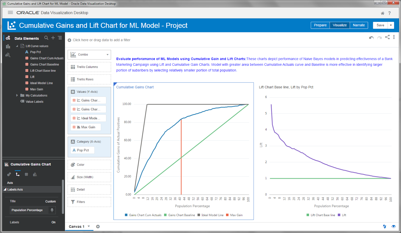
Oracle Analytics Store has an example project for this that was build using Marketing Campaign data of a bank. This is how the charts look like:

Scenario: This Marketing Campaign aims to identify users who are likely to subscribe to one of their financial services. They are planning to run this campaign for close to 50,000 individuals out of which only close to 5000 people i.e., ~10% are likely to subscribe for the service. Marketing Campaign data is split into Training and Testing data. Using training data we created Binary classification ML model using Naive Bayes to identify the likely subscribers along with prediction confidence (note that the Actual values i.e., whether a customer actually subscribed or not is also available in the dataset). Now they want to find out how good the model is in identifying most number of likely subscribers by selecting relatively small number of campaign base(i.e., 50,000).
ML models are applied on Test data and got the Predicted Value and Prediction Confidence for each prediction. This prediction data and Actual outcome data is used in a dataflow to compute cumulative gain and lift values.

How to interpret these charts and how to measure effectiveness of a Model:
Cumulative Gains chart depicts cumulative of percentage of Actual subscribers (Cumulative Actuals) on Y-Axis and Total population(50,000) on X-Axis in comparison with random prediction (Gains Chart Baseline) and Ideal prediction (Gains Chart Ideal Model Line) which depicts all the 5000 likely subscribers are identified by selecting first 5000 customers sorted based on PredictionConfidence for Yes. What the cumulative Actuals chart says is that by the time we covered 40% of the population we already identified 80% of the subscribers and by reaching close to 70% of the population we have 90% of the subscribers. If we are to compare one model with another using cumulative gains chart model with greater area between Cumulative Actuals line and Baseline is more effective in identifying larger portion of subscribers by selecting relatively smaller portion of total population.
Lift Chart depicts how much more likely we are to receive respondents than if we contact a random sample of customers. For example, by contacting only 10% of customers based on the predictive models we will reach 3.20 times as many respondents as if we use no model.
Max Gain shows at which point the difference between cumulative gains and baseline is maximum. For Naive Bayes model this occurs when population percentage is 41% and maximum gain is 83.88%
How to compare two models using Cumulative Gain and Lift Chart in Oracle DV:
To compare how well two ML models have performed we can use Lift Calculation dataflow(included in the .dva project) as a template and plug in output of Apply Model dataflow as data source/input to the flow. Add the output dataset of Lift Calculation to the same project and add columns to the same charts as shown above to compare. Please note that the data flow expects dataset to contain these columns(ID, ActualValue, PredictedValue, PredictionConfidence). This is how it will look like when we compare two models using same visualizations:
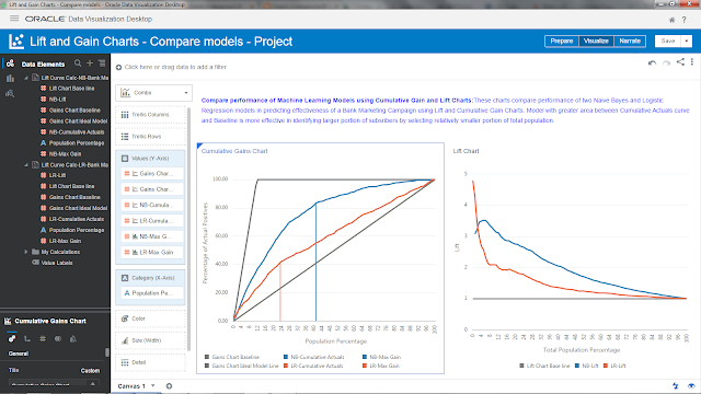
.
What are Cumulative Gain &Lift charts and what are they used for?
Let us suppose that a company wants to perform a direct marketing campaign to get a response (like a subscription , purchase etc) from users. It wants to run marketing campaign for around 10000 users out of which only 1000 users are expected to respond. But the company doesn't have a budget to reach out to all the 10000 customers. To minimize the cost company wants to reach out to as less customers as possible but at the same time reach out to most (user defined) of the customers who are likely to respond. Company can create ML models to predict which users are likely to respond and with what probability. Then the question comes which model should I choose? Which ML model is likely to give me the most of number of respondents with as less selection of original respondents as possible? Cumulative Gains and Lift chart answers these questions.
Cumulative Gains and Lift chart are a measure of effectiveness of a binary classification predictive model calculated as the ratio between the results obtained with and without the predictive model. They are visual aids for measuring model performance and contain a lift curve and baseline. Effectiveness of a model is measured by the area between the lift curve and baseline: Greater the area between lift curve and baseline better the model. One academic reference on how to construct these charts can be found here. Gains & Lift charts are popular techniques in direct marketing.
Sample Project for Cumulative Gains and Lift chart computation
Oracle Analytics Store has an example project for this that was build using Marketing Campaign data of a bank. This is how the charts look like:
Scenario: This Marketing Campaign aims to identify users who are likely to subscribe to one of their financial services. They are planning to run this campaign for close to 50,000 individuals out of which only close to 5000 people i.e., ~10% are likely to subscribe for the service. Marketing Campaign data is split into Training and Testing data. Using training data we created Binary classification ML model using Naive Bayes to identify the likely subscribers along with prediction confidence (note that the Actual values i.e., whether a customer actually subscribed or not is also available in the dataset). Now they want to find out how good the model is in identifying most number of likely subscribers by selecting relatively small number of campaign base(i.e., 50,000).
How to interpret these charts and how to measure effectiveness of a Model:
Cumulative Gains chart depicts cumulative of percentage of Actual subscribers (Cumulative Actuals) on Y-Axis and Total population(50,000) on X-Axis in comparison with random prediction (Gains Chart Baseline) and Ideal prediction (Gains Chart Ideal Model Line) which depicts all the 5000 likely subscribers are identified by selecting first 5000 customers sorted based on PredictionConfidence for Yes. What the cumulative Actuals chart says is that by the time we covered 40% of the population we already identified 80% of the subscribers and by reaching close to 70% of the population we have 90% of the subscribers. If we are to compare one model with another using cumulative gains chart model with greater area between Cumulative Actuals line and Baseline is more effective in identifying larger portion of subscribers by selecting relatively smaller portion of total population.
Lift Chart depicts how much more likely we are to receive respondents than if we contact a random sample of customers. For example, by contacting only 10% of customers based on the predictive models we will reach 3.20 times as many respondents as if we use no model.
Max Gain shows at which point the difference between cumulative gains and baseline is maximum. For Naive Bayes model this occurs when population percentage is 41% and maximum gain is 83.88%
How to compare two models using Cumulative Gain and Lift Chart in Oracle DV:
To compare how well two ML models have performed we can use Lift Calculation dataflow(included in the .dva project) as a template and plug in output of Apply Model dataflow as data source/input to the flow. Add the output dataset of Lift Calculation to the same project and add columns to the same charts as shown above to compare. Please note that the data flow expects dataset to contain these columns(ID, ActualValue, PredictedValue, PredictionConfidence). This is how it will look like when we compare two models using same visualizations:

.
Are you an Oracle Analytics customer
or user?
We want to hear your story!
Please voice your experience and provide feedback
with a quick product review for Oracle Analytics Cloud!
4 comments:
I have one question on this project, When building the model with training Data(Bank Marketing Campaign Data), the user could specify the 'training partition percent'(default is 80%). My question is when applying and scoring the model, it uses the sames data as training dataset.. Normally in order to improve the accuracy, we should use remaining 20% of data as a test dataset. In this scenario, entire dataset is used for applying the model or it automatically define the test dataset and use it?
nice blog , very helpful and visit us for VISUALIZATION SERVICES in India
It's a Best post! Thank's for sharing your knowledge to others, it was very informative and in depth one.
Machine Learaning Using R Training in Electronic City
It's interesting that many of the bloggers to helped clarify a few things for me as well as giving.Most of ideas can be nice content.The people to give them a good shake to get your point and across the command.
Email Marketing
Post a Comment